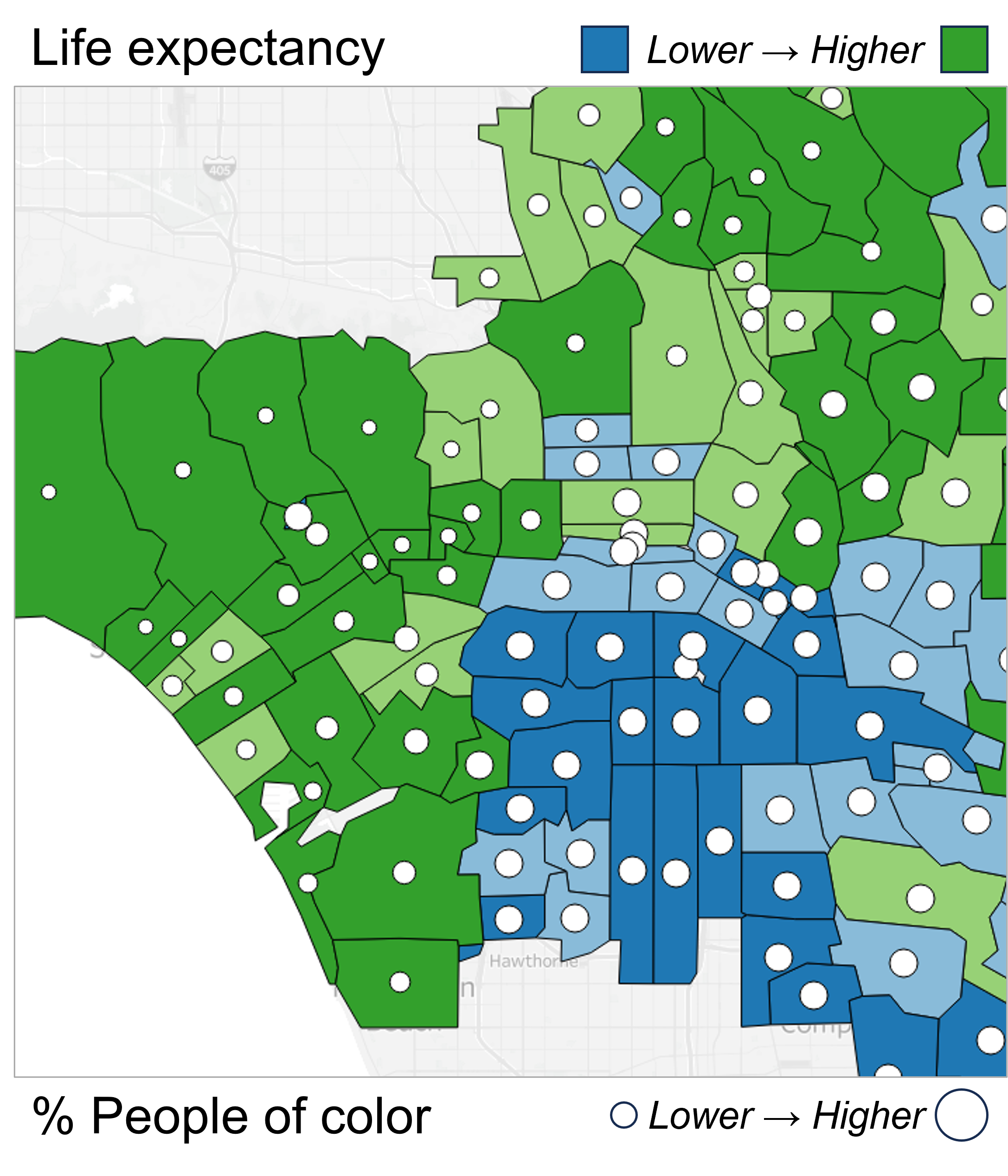
CCHE developed an online tool to identify health needs in Kaiser Permanente communities

The Tableau dashboards were created by mapping data downloaded from national sources such as the American Community Survey to specific county-level or ZIP code level geographic areas surrounding Kaiser Permanente facilities. For each health topic, users can see how their community compares to the national average to understand where the greatest health needs are.
Key Features:
- Drilling down to explore specific community needs by filtering data to geographic areas of interest and identifying neighborhood-level disparities
- Overlaying demographic information onto the maps, such as the percentage of the population by race or ethnicity
- Interactive elements and visualizations in each section that can be saved as images or PDF files
- Ability to create customized downloads of the underlying data
CCHE is using the data platform, along with other data sources, to complete community health needs assessments in all communities served by Kaiser Permanente. Explore the data platform and supplementary materials to learn more!
Coming Soon! CCHE is working on a version of the platform that expands the platform to includes all counties in the states where Kaiser Permanente provides care and coverage. So, if you work with partners in California, Colorado, the District of Columbia, Georgia, Hawaii, Maryland, Oregon, Virginia, or Washington, please contact us if you would like to learn more about its release.